

Producing quality prints with speed and accuracy is the result of a good collaboration between client and printer. Below are some guidelines that might be useful to you as you plan to get your materials printed.


Color values change from one light source to another. The same color will look different under different light source. Natural light or white light are recommended for proper viewing conditions.
The same ink color looks different when viewed against different backgrounds or next to different colors.
Colors may change when printed materials are exposed to prolonged sunlight.
The same color looks different when applied by different printing systems to different materials. The same color printed on coated paper will look different when printed on uncoated paper.
Digital proofs usually have a 10% variance to the actual press run.
When specifying colors, please state if you want to “use” a color or “match” a color. Using a color build means printing screen percentages of inks according to guidelines in a swatch book regardless of how other factors, such as paper, might affect the outcome. Matching a color means that you want color on your printed piece to look as close as possible to the color you see in a swatch book or in a sample such as a piece of fabric.
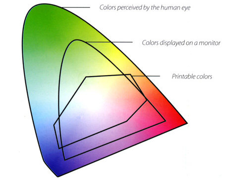
Monitors that are not calibrated may produce a different “colorant”.
